From the time I started pasting up around Melbourne I have had constant support, encouragement and practical assistance from my awesome mate Christy. Saturday was her last day in Melbourne before heading back to Canada and we tried to pack as much Melbourne memories into one day as possible!
Starting the day with nourishment from Arcadia on Gertrude St
Then to the studio of Ghostpatrol & Miso to get C a lil' bit o' Melbourne inked onto her arm...
...in the form of a Ghostpatrol character!
David generously packed us each a little care package :)
then we headed to Board @ NGV for some arty, skatey goodness,
followed by a trip down Hosier Lane...
we came across some awesome mural work by our mate Ero
as well as some more subtle pieces... ouch!
And finally, the perfect end to the perfect day - burritos!
Thanks Christy for a great day and for being such an awesome friend, wandering the streets at night with a bucket of wheat-paste won't be the same without you! x
I have a huge love and respect for all things typographic. I think I
was about 8 when I convinced my parents that the book they should buy me
from the annual school book fair was The Lettering Book
(any kid from the 80's who cared more about how their school project
looked rather than the actual content of it will remember this essential
book). They thought I was too young to grasp the idea of transferring
the type in the book to whatever school project I was embellishing. They
were wrong. I used that book until it was within an inch of it's life.
The spiral bind did not fair well with my constant use of the book and
my mum rebound it with pale pink wool. No typeface went unused - or
unloved, that book went everywhere with me.
Many years on
and I still am passionate about typography. My first solo show "All the
Things She Thinks About" was based on hand lettering. My second solo
show "Vern Sherman Drinks Tea and Other Tales" had some elements of
typography within it, including the piece LOVE
which was inspired by this street art I snapped while in San Francisco
but now I find that type is not so much a part of my
work anymore, yet I still feel very inspired by artists who base their
work on the letter form.
Today I came across the work of Nicole Dextras.
Her icy typography is stunning to say the least and it got me thinking
about other artists whose work I love and admire for their use of
typography.
These 7 foot letters by Dextras are my favourite.
Margaret Kilgallen is another artist whose work I really love.
Sadly she passed away in 2001, but left her mark with some amazing type
based murals and installations. Small or large, her work is amazing.
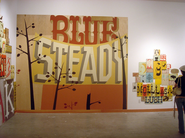
In a similar, yet more rustic vein The Date Farmers
from Mexico are also inspired by vintage signs. They use typography to a
lesser extent than Kilgallen, but it accents their work perfectly.
Herakut have also been inspiring me. I have been poring over their book The Perfect Merge and although they don't always use type they have developed a couple of their own unique typefaces to use in their work.
And I couldn't do this post without mentioning Timba Smits
Inspired by vintage advertising, packaging, signage etc, not only is
his lettering stunning, but he also has a fine eye when it comes to
colour.
It started many years ago and I didn't realise until quite recently that I have a bit of a thing for pencils, but the 'thing' is that they need to be found. I have subconsciously been holding onto found pencils that I have picked up here and there for as long as I can remember. Now that it has become a conscious thing I've decided to document it. The furthest back I can knowingly trace my current collection to is 2005, Israel, so here it begins...
For the last few months I have been hanging out with a bunch of really talented 14 & 15 year old artists. It's been a blast.
Every Friday morning I've been up bright and early (maybe less of the bright and more of the early...) to head off to Strathmore Secondary College in Melbourne's northern suburbs to join the class of 24 for their Artist in Residence program.
The program involved, in a nutshell, me talking about my art practice and then showing the students how to do what I do. Not that these guys needed too many tips in the drawing department, I was not making work any where near as good as most of them when I was their age!
My time there evolved into one big paste-ups workshop, which I have to say was pretty cool. Our first exercise was pasting up small artwork around the school - which was received with excitement and enthusiasm by teachers and students alike.
As we planned our next project and started working on new designs we took a short trip into the city to see what other artists had been doing on the streets as well as checking out the Space Invaders exhibition at RMIT Gallery.
Checking out a Drab paste up off Drewery Place
Union Lane
Sniders Lane
Feeling very inspired, the students spent the next couple of weeks working really hard (lunchtimes and afterschool!) to finish their paste ups for the wall they were to collaborate on. We did a paste-up collage on the fence at the Corner
Café on Woodland St in Strathmore. Some students worked in small groups of two or three, others flew solo, but the wall as whole looked pretty amazing after the first week of pasting!
Most of the larger paste ups went up on this first week of pasting, and some more were added last Friday. I will snap some shots of the updated artwork next time I am up that way. The locals are loving it and the
beauty is that it will continue to evolve.
Sadly though, Friday was my last day. I was spoiled by the class who bought me a really big bunch of flowers and made me one of the best cards I've ever received - 4 pages of really lovely messages from each of them as well as some photos of their paste ups.
A big huge thanks to Lauren, the co-ordinator of the Artist In Residence program for inviting me to be the artist for the last semester. I had a great time and I felt pretty lucky to be surrounded by such a great group of young artists, who I'm sure we will see around in the not too distant future.
About a year ago my mate Joe over at Pots and Pans recorded a catchy little tune called Against the Grain (plus a few others) for Melbourne based muso Hudson. I then did the artwork for the EP titled Open Up Slowly.
Just recently Hudson teamed up with Dropbear who put together this amazing clip. Given my love for pencils, I gotta say this could easily be my favourite film clip of the year (and I've had a few faves!) Nice work guys!
In other music video news, but still in Melbourne, we have a very cool clip by Bright Knights. Over a thousand people contributed to the making of the clip to This Love. I have a frame in there somewhere. A great collaboration, it takes quite a few views to take it all in!
Having found a killer spot in the city for my Street Advent piece, I couldn't resist the urge to be the first artist in the line up!
This piece is located in Centre Place in the heart of Melbourne's CBD.
On December 2 we had Year of the Shorts contribute some nifty pieces around the Brunswick area, today we revealed Phoenix's piece off Franklin Street outside the Blender studios in the CBD. I've had a sneak peek at tomorrow's piece already and it's a quite fun and festive work by one of Melbourne's favourite street artists, so keep a watch out on the Street Advent website for photos! The participating artists are (in a completely random order to keep the good ol element of surprise)
Rena Littleson Benjamin Reeve skulk Guz Mason (Canada) Mishap Dopio I & The Others Year of the Shorts Phoenix Kaff-iene Blomtrog Decycle (Germany) Andros Olive47 Klara Jinks Terrible Horrible Pete Daniells Birdhat Nommric Facter James Belveander Fezwitch Internet